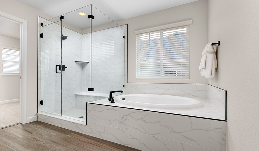
If you’re looking to move in a hurry, it may feel like a challenge to find a beautiful home that fits your needs and is ready quickly. However, resale isn’t your only option! With Curated by Richmond American, we’re combining the designer home interiors we’re known for with the shorter timelines you want. The end result? Brand-new houses that are ready to close in 90, 60 or even 30 days.
Read on to learn more about what sets our curated homes apart!

What is Curated by Richmond American?
According to the Merriam-Webster dictionary, the term curated refers to something that is “carefully chosen and thoughtfully organized or presented.” That’s exactly what our professional designers do—they carefully select fixtures and finishes to create designer home interiors that reflect both timeless elegance and universal appeal. This includes flooring, countertops, cabinets, backsplashes, light fixtures and the many other elements that can make a house as eye-catching as it is livable.

What are the benefits of a designer-curated home?
- Professionally coordinated products. Our experienced design team works hard to provide buyers with a stunning home that’s ready to be filled with furnishings and art. They keep tabs on the latest styles, incorporating them with classic elements that ensure longevity and versatility.
- Brands you know and trust. Creating designer home interiors is certainly much easier with the help of high-quality products from recognizable brands, which is why we work with vendors such as GE®, Sherwin-Williams®, Kichler®, Emser Tile®, Kwikset® and more.
- Faster move-in timelines. As mentioned above, our curated homes are also quick move-in homes, meaning they are complete or nearing completion and may be able to close in as little as 30 days. You can find active listings in your area on our website.
- Less variability in interest rates and costs. The sooner you close on your new home, the less chance there is for your interest rate to fluctuate. And because the fixtures and finishes have already been selected and added, there’s no uncertainty as to how much the design elements will cost—they’re already factored into the final home price!
- Ability to tour. When you shop our curated homes, you’ll have the opportunity to tour the exact house you’re interested in, which means more certainty and less mystery. Explore the closet space in person, measure the great room for your furniture and start planning the meals you’ll prep on that kitchen island!

Ready to find the curated home of your dreams? Our New Home Specialists are here to help! Call 888.799.8322 or chat with them online to get started.
For more information on curated quick move-in homes, check out these reads from our blog:
- Kitchen and Bath Design in Our Curated Homes
- Benefits of Buying a Quick Move-in Home
- What to Expect When Buying a Quick Move-in Home
Closing dates are subject to change and cannot be guaranteed. Homebuyers may be limited in the structural changes, options and upgrades which can be made to homes.
Is it possible to buy new construction and move soon?
Our free guide walks you through the process of buying a quick move-in home. You may not want to wait to watch a home be built when you have this option.


